Piece description from the artist
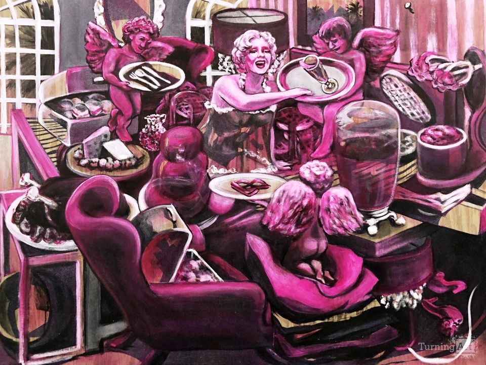
Using a "Judgement of Paris" theme, this painting shows a person waking up in bed with a breakfast buffet, being presented with three options from three angels: she might choose glasses (to see her situation more clearly), silverware (with which to interact with her surroundings) or starting the day getting loose with a glass of champagne. She appears to have woken up drunk, does not understand the question – and will not be answering it!
Is she dreaming? Is this really happening? Does this really happen – does there really exist this level of… food abuse? She appears to be single in the scene, so nobody will likely ever know – and brava to that!
Spray paint and spray glitter provide structure to the composition and a gripping texture to the painted details, with some areas as dark as velvet and other parts sparkling through the thinnest of painted layers. Star Power was made to be both immediately engaging as well as rewarding to those who spend time letting the image come to them. As a print, the composition and content circulate ideas and connections in a constant motion. Quinacridone Magenta demonstrates color variances thinned with water or volume tinted with white, the difference being a luminosity versus a thickness. This effect's obviousness – the density of the paint causing a range of reds to magenta, and the white tinting screaming out voluminousness – is then distributed proportionately around the composition, enhancing the distribution of dark values already set by the spray paint. As the paint is applied, the spray glitter works as a lifter to the paint, causing glow and shading effects unique to this process.
The sparkle of glitter appearing and glistening through transparent paint is the conversation you want to be able to have with your guests about your art collection. As an easy, unpretentious entry point to the case for original versus edition work, the effect is a contributor to understanding the painting itself as an art object. My paintings are on plywood to highlight and evangelize the idea that painters transform objects with paint into other objects, and we do this to provoke thought about representation (for instance, those cute shoes in the corner, are they enough in the second dimension? does a person need the actual shoes? for what, a photograph of the one time they are worn, why not let them be enjoyed in the painting and see them every day?). I am pleased to involve the material into my ideas and have been truly surprised by its extended contributions to my work.


Bethany Britz achieved a BFA in Painting at the Center for Creative Studies in Detroit, Michigan; and an MFA at the Pennsylvania Academy of the Fine Arts in Philadelphia. Early recognition of her work in those cities caused a purchase by the Detroit Institute of Arts Museum, among other collectors and sales through Roger LaPelle Galleries in Philadelphia. In 1998, her studio moved to the bay area of California, which tested and transformed many of the ideas brought from the East. The resulting image style that caused awareness of her work tells the story of a Detroit perspective style with an illustrative bent; a classical approach to the figure taught in Philadelphia; and a simplified description of form, well received in California. The process of working with wood panel surfaces became a way to work aggressively with a reductive/additive process while yielding a resilient, furniture-like result. Britz was represented in Oakland by Esteban Sabar Galleries and was named the 2006 Best Artist of the East Bay, according to the East Bay Express, and has been collected by many private collectors during the span of her career.
Britz's paintings are well constructed, easy to install and move, well composed and painted, and friendly in their engagement. If people form relationships with the art that they see everyday, there is depth in both her skills and concepts for a fix up with Britz to easily last long term.
The new series of paintings about brunch uses spray paint and spray glitter as foundational layers. Britz's process most often begins with a "cartoon" layer, or a preliminary painting on a sticker right on top of the surface, which she progressively cuts away to create the painted image. Because the texture of spray paint disguises the artist's hand, the preliminary painting is made especially lively, so that the spirit of the shapes can survive the reductive phase of the process. After the foundational layers cure, thin layers of dark brown, blue or black are introduced into the glitter texture, deepening the values and clarifying the image. Highlights in white finish the description.
The brunch series exploits this process so as to imitate the classical, Italian Style. Light against dark against light is a simultaneous theme of the series and the cartoon process lends itself to making this effect happen. In this series, glitter has shed its pedestrian fanciness, and is pointed at working two dimensionally to add glow and distribute texture.
An Art Advisor will get in touch with you today to schedule a free consultation to discuss your artwork needs.
Get Started By
By